What are they?
Picture this…you wake up after a good night’s sleep (play along, even if it wasn’t), you get ready for your day – preparing and/or gathering up all of your essential things, “Putting on your game face” with a splash of gusto, making a cup of your favorite happiness, and have started to plan out your day. You get in your car, and have finally gotten around to getting to where you’re going…with your essential things prepared and gathered, your game face freshly splashed with gusto, your day thoroughly planned out, and your cup of happy by your side…on the lookout for any pedestrians and cars, keenly focused on the street signs and lights, when suddenly you’re wondering why Michael Scott (from The Office) is such an idiot, after the show you watched last night, then BAM!!!…you hit a pothole that you: a) already knew was there, and keep forgetting about because of all of the other things which are juggling around in your brain leading up to it, or b) weren’t aware of, and didn’t know was coming.
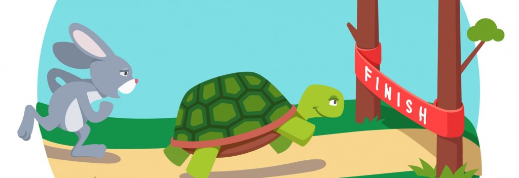
There you have it – a [relatively] quick summary of the user journey pothole, from a user’s perspective. To describe a user journey pothole not only includes describing the pothole, but the user’s journey leading up to one. I’m going to put a pin on that thought, and get back to it in a second. First, we should probably get a better look at that pothole you just hit, in the context of building an accessible website.
User Journey Crime Scene Investigator Brendan is on the scene – and make no mistake, a crime has been committed here, since our metaphorical user journey car’s wheel, and suspension just got creamed by a nasty user journey pothole, which will surely accelerate the costs associated with you, the user in this scenario, being able to operate your user journey vehicle! OK, lets see, what do we have here…yeah, that’s a nasty pothole, alright.

Well, let me dig into my Blog bag and dig out the four guiding principles of accessibility – geared around improving website accessibility, which included:
For those who prefer a quick summary on my prior blog posts which discussed these guiding principles of accessibility in detail – the key takeaway from these posts is that they help guide an organization towards putting people at the center of the web design process. Having said that, attempting to follow these principles can prove difficult without having a good idea of where or when to apply them (hence, the user journey potholes), in order to begin to understand how to recognize other scenarios at one’s organization for which they can be applied.
So, lets get some additional context around what these potholes can potentially look like. Some example user journey potholes, as referenced in my prior blog posts that focused on accessibility, include web interfaces that: do not allow a user to quickly enable accessibility assistance options, lack error recovery features, and are missing helpful background info. Another potential user journey pothole worth mentioning is animation-overload. While the set of accessibility principles previously discussed already account for the need to account for different user technologies, and while it does a good job covering the basics on how to avoid “Information-overload,” a similar type of user journey pothole to animation-overload, animation-overload avoidance is a topic that is deserving of a completely separate post category since it presents a unique set of challenges which every web design team needs to be mindful of.

There are several types of web animation, which I may (and probably will!) get into further detail in future posts – perhaps including shared experiences regarding what I have personally found to work well (and/or not so well). For the purpose of today’s post, it is time to unpin the thought about how “…describing a user journey pothole not only includes describing the pothole, but also the user’s journey leading up to one.”
Why Do they Matter?
If I were to describe a certain type of interactivity which an organization might plan on designing into a particular user interface, including animation of one or more web page elements which would produce a: bouncing, distorting, fading, flipping, rotating, sliding, or zooming (just to name a few) effect, I would be describing a web design tool, which – when isolated without any of the organization’s user needs needing to be taken into consideration, can be very pleasing to the eye and/or entertaining to watch – much like it is for those who enjoy attending a musical, comedy club, Broadway play, sporting event, etc.. However, that is often not the case for all of an organization’s intended users, depending on their user journey and the needs that are associated with it.
How to Avoid them
To that end, there are many quick-read articles focused on animation best practices which are easy to access on the web, from which one can extrapolate best practices from, and extend their application towards his/her own user interfaces. I found one such article published by Wix, a web-hosting website, which I want to reference in order to validate and quickly articulate a couple of key principles which I want to highlight in today’s high-level animation-overload post. The first key animation principle is:
Moderation is a strength, not a weakness.
“When it comes to animation, like all good things in life (including ice cream and watching Breaking Bad), moderation is key. It is absolutely vital that you restrain yourself from blasting the screen with an overdose of animation. For one, you don’t want to make your site too heavy and overburden its performance. In addition, you don’t want to distract visitors with too much action. Keeping things light will make sure that your visitors are enjoying a smooth browsing experience and are following your website’s flow.” The second key animation principle is:
Animation needs to be justified with a defined purpose.

Every animation that a web designer applies to a user interface needs to perform a task that fulfills a particular user need, such as:
- Guiding the site’s movement by showing visitors when to scroll and where to click.
- Supporting your storytelling by gradually revealing items.
- Visualizing your product’s or service’s impact
- Breaking the site’s static scroll with some motion.
- Creating a particular atmosphere on websites that are uniquely suited for animated content, for instance, an online store for children’s clothing.
In summary, trying to understand everything that leads up to a potential animation-overload pothole, is just as important as the pothole itself. Having a full understanding of the user journey is what will allow a web design team at your organization to decide if a particular animation should be classified as an animation-overload pothole, or not. Your organization’s web design team will want to establish a few key guiding principles such as the two provided in this post, which are aimed at avoiding the user journey potholes which effect your users the most, when attempting to create interactive user interfaces.
A friendly note to those who are following…I will be taking a hiatus from my blog for a while, and plan to share more thoughts on optimizing a customer’s connected experience, in the future. Stay tuned!
